.svg)

.png)
Watch Video Here: https://bit.ly/3PxR2wA
The Nike logo is one of the most recognizable symbols on the planet. You see it on athletes, billboards, sneakers, and championship moments. But when it was first created, almost no one thought much of it. Not even Phil Knight.
It was not treated like a breakthrough or a defining moment. It was just a quick decision made in the middle of building something new.
I’m Owen Osinde, and this is The Underrated, where we share stories that highlight the moments and decisions that quietly shaped business, sports, music, and culture.
Nike is one of the biggest brands in the world today, but it did not start that way. Back in the 1960s, when Phil Knight founded the company, it was called Blue Ribbon Sports. At the time, they were not even making their own shoes. They were importing and selling sneakers from a Japanese brand called Onitsuka Tiger.
Over time, Knight started thinking bigger. He did not just want to sell someone else’s product. He wanted to build something of his own. Something he could control from the ground up.
By 1971, Blue Ribbon Sports was preparing to launch its first shoe under its own brand. That meant they needed a new identity. They needed a name that felt bold, memorable, and connected to winning.
They landed on Nike, inspired by the Greek goddess of victory. The name captured everything they wanted the brand to represent. Speed, ambition, and success.
But there was still a problem. They had a name, but no logo. And with production already underway, they needed one fast.
At the same time, Phil Knight was teaching accounting at Portland State University. One day after class, he overheard a student named Carolyn Davidson talking about how she could not afford her oil painting supplies. Knight approached her and asked if she could help design a logo for his new brand.
She agreed.
There was no formal contract. No discussion of royalties. Just a simple freelance arrangement at two dollars an hour. To Carolyn, this was just another small project to make some extra money.
When she started working on the design, she kept it simple. She wanted something that felt like movement. Something that captured speed, energy, and the idea of winning.
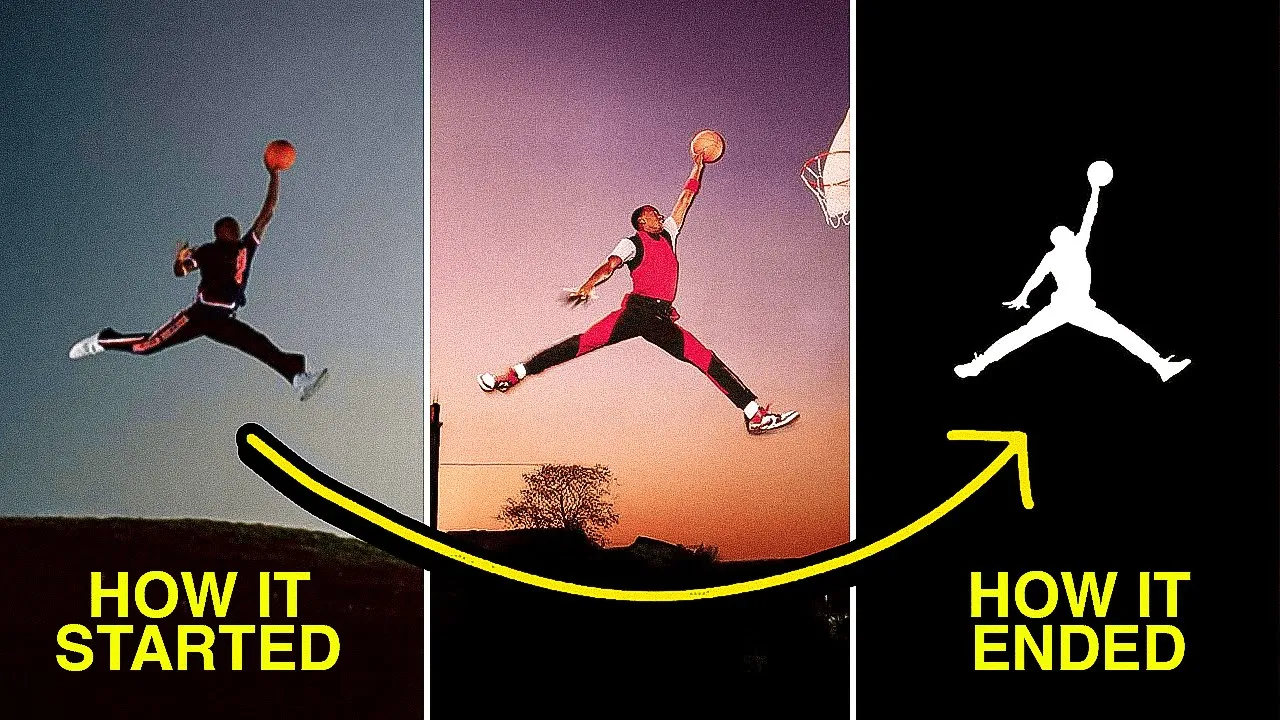
She came up with a few concepts, but one stood out. A curved checkmark inspired by the wing of the Greek goddess Nike.
That design became the Swoosh.
What is surprising is that the reaction to the Swoosh was not very enthusiastic. Even Phil Knight was not fully convinced. He did not love it at first. His reaction was simple. It might grow on him.
Carolyn probably did not think much of it either. To her, it was just another small job.
But the company was on a deadline. The shoes were already being produced, and they needed a logo they could move forward with. So they went with it. Not because it felt groundbreaking, but because it worked well enough.
At the time, it did not feel important. It was just one of many small decisions the company was making while trying to get off the ground.
The first time the Swoosh appeared on a sneaker was on the Cortez, Nike’s first major shoe designed by Bill Bowerman. Some versions even had the word Nike written over the logo because the symbol alone did not mean much yet.
Most people probably did not notice it.
And that is the point.
The value of the Swoosh did not come from the design alone. It came from what the brand built around it.
As Nike grew and more athletes started winning in their shoes, the Swoosh slowly became associated with performance and excellence. By the 1980s, it had become iconic. It reached a point where the symbol stood on its own. No name needed.
It was no longer just a logo. It became something people wanted to be part of.
For Carolyn Davidson, none of this was obvious at the time. When she finished the project, she was paid a total of thirty five dollars and moved on.
Years later, in 1983, Nike had grown into a global company. The executives reflected on the impact of her work and decided to recognize her contribution.
They invited her to a surprise event. At that event, she was given a gold ring with a diamond Swoosh and 500 shares of Nike stock.
At the time, those shares were worth about eighty five hundred dollars. Over the years, after multiple stock splits, that number grew into tens of thousands of shares. Today, that stake would be worth around two million dollars.
What started as a thirty five dollar design became one of the most powerful symbols in the world.
The Swoosh worked because it was simple. At a time when many logos were complex and crowded, this one did not try to do too much. It felt natural. It suggested motion. It fit perfectly with a brand built on performance.
And over time, it became more than a design. Campaigns like Just Do It turned it into a cultural symbol.
That single curved line ended up saying more than words ever could.
But when Carolyn Davidson first sketched it, none of that was clear. It was just a small freelance project.
And that is what makes this story so powerful. Some of the most iconic things in the world do not start as big moments. They start as small decisions that compound over time.
If you enjoyed this, make sure to follow along. We share stories like this every week.
.png)
.png)
%20(1).jpeg)


.png)
.png)
.png)